Creative storyteller across digital, web, and media
Creative storyteller across digital, web, and media
04
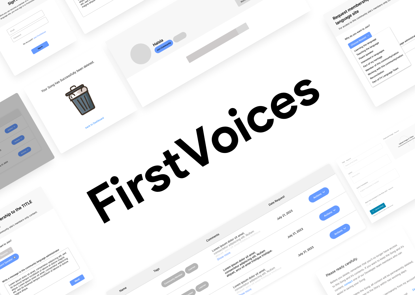
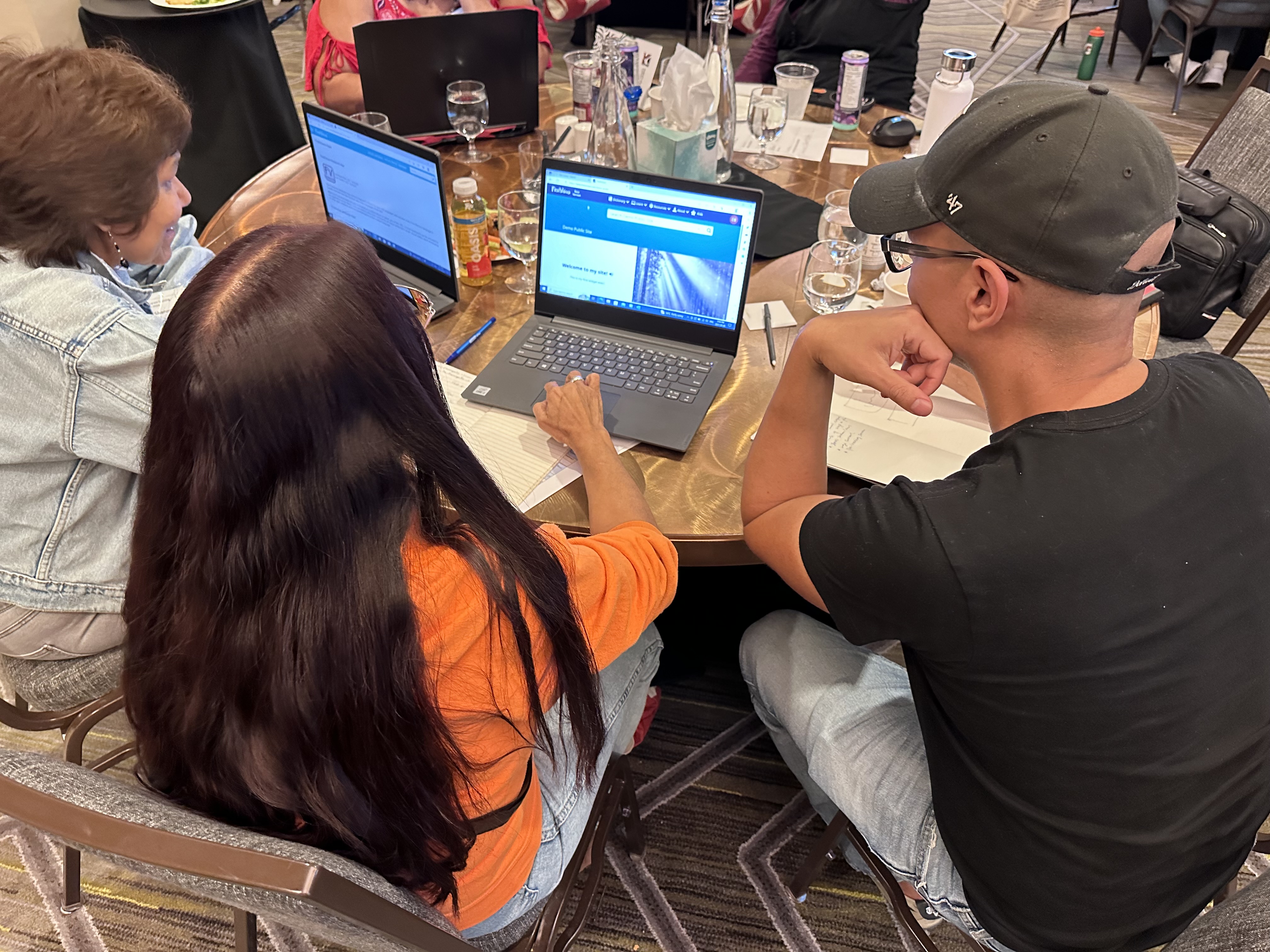
When I first started at FPCC, I was thrilled to be assigned to the FirstVoices development team. My primary role was to enhance the user experience (UX) and user interface (UI) in preparation for the official launch of the FirstVoices platform. This involved conducting user research, analyzing navigation patterns, and proposing design solutions to ensure that the platform would be intuitive and accessible for Indigenous communities seeking to preserve and revitalize their languages.
Wireframes
Prototype
High Fidelity Wireframes
User Testing
Feedback
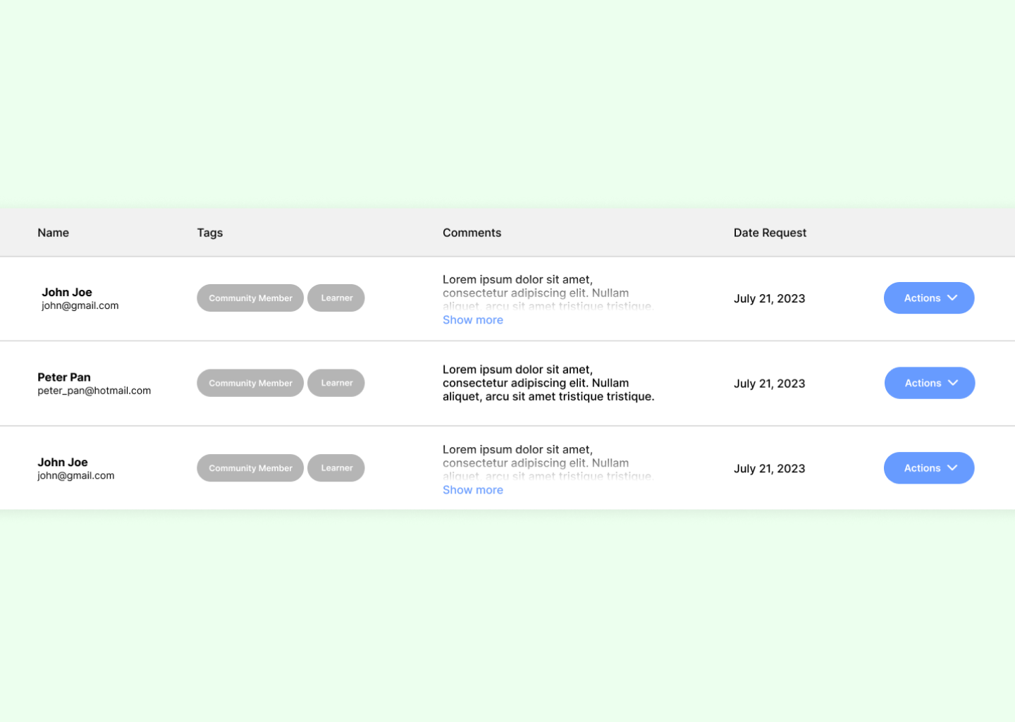
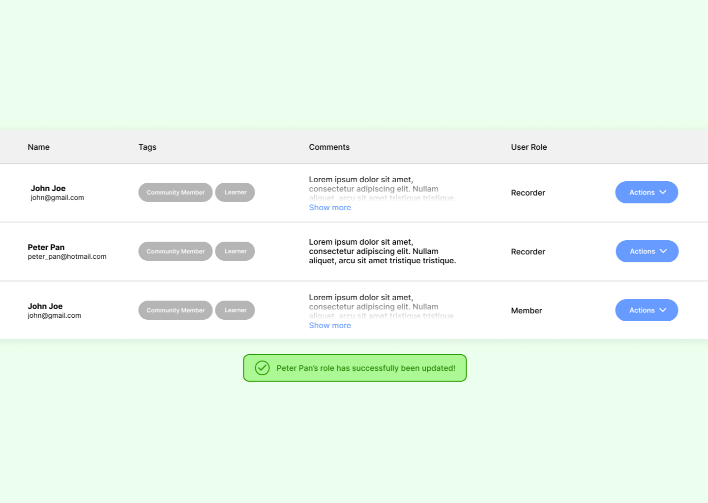
Manage users with roles and permissions, ensuring secure access and control over content. Features include user creation, editing, and deletion, with clear visual feedback for actions.


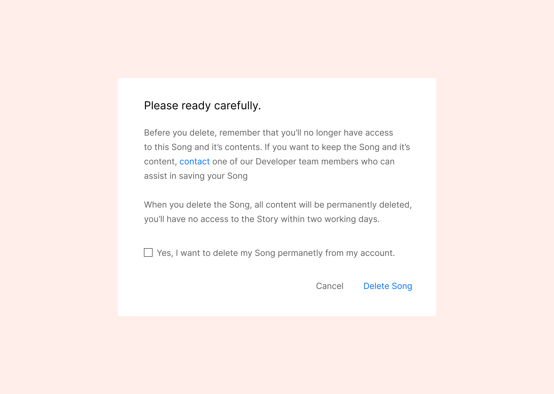
The FirstVoices “Joining Community” feature presented a unique challenge: to design a journey that was both simple for users and capable of handling the complexities of joining a community’s language page.


This gives users a sense of progress and control while offering seamless CRUD operations (Create, Read, Update, Delete). They can save their work, ensuring no data is lost, carefully review their content before submission, and manage visibility settings (private or public).


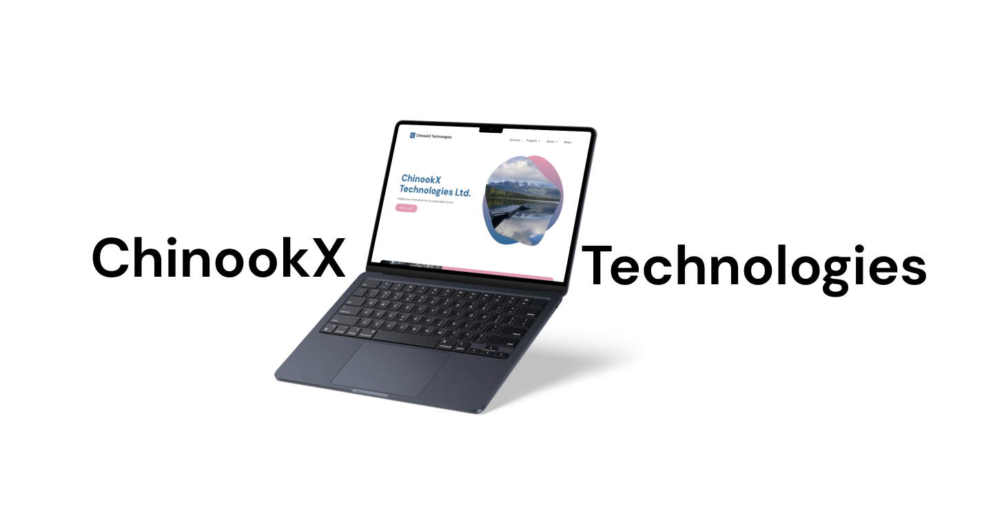
We began with a wide net, exploring 12 potential logo concepts for Chinookx Technologies. Through careful review and feedback, we progressively narrowed our focus, whittling it down to three strong contenders. After much deliberation, a single logo emerged as the clear winner.


The team wanted a color scheme that would subtly evoke the namesake of their company. They aimed for a blend that mirrored the coloration of the Chinook salmon itself – a rich, muted copper-pink reminiscent of the fish’s flesh, balanced by a cool grey that hinted at its natural habitat.


I selected DM Sans as the primary typeface due to its modern, sleek, yet undeniably contemporary aesthetic. My goal was to create a brand identity that bridged traditional elements with a forward-thinking approach, and DM Sans perfectly embodied that balance. Its clean lines and subtle geometric details convey a sense of technological precision.

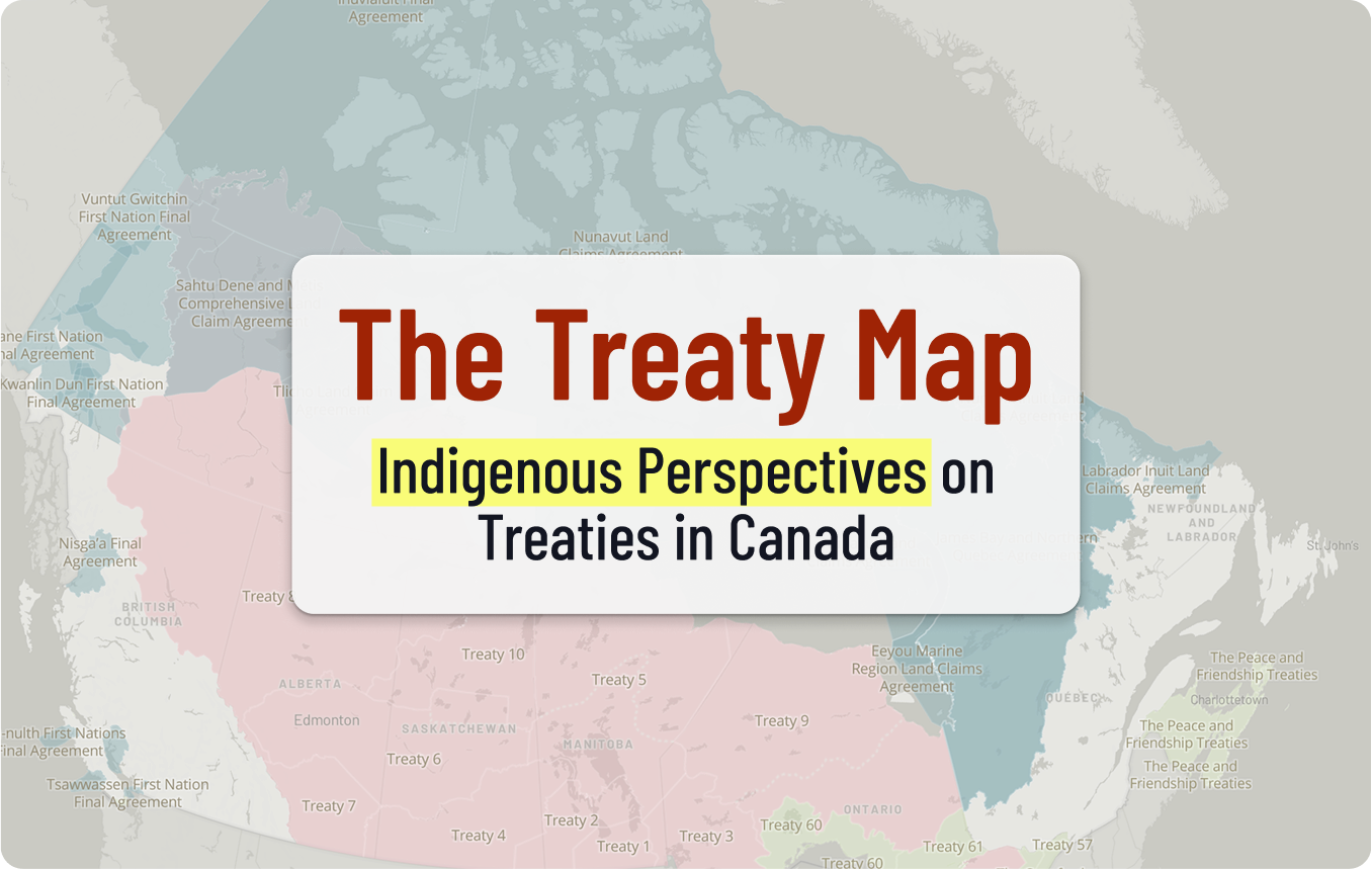
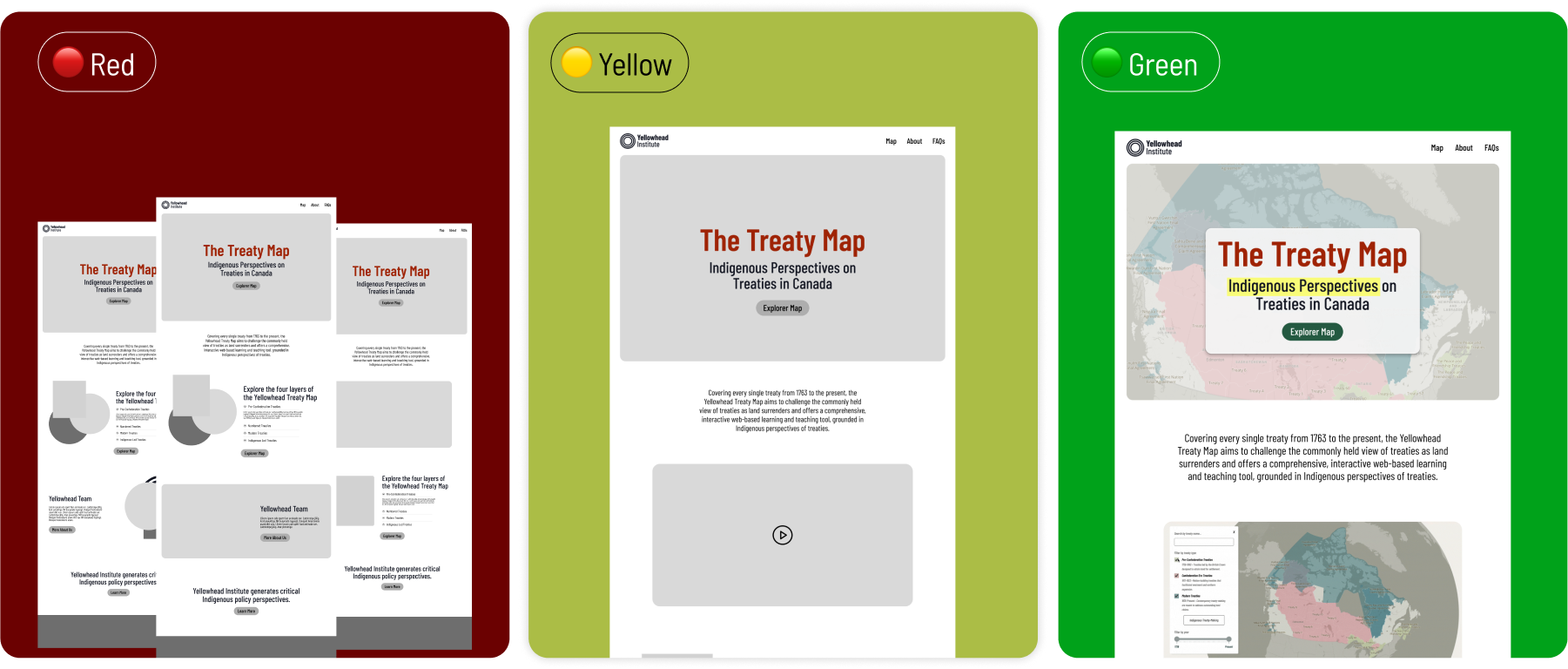
I designed the Treaty map in three phases. The red phase was for brainstorming every possible idea. During the yellow phase, I funneled those concepts into concrete wireframes. The final green phase was for polishing the final designs and preparing them for development.
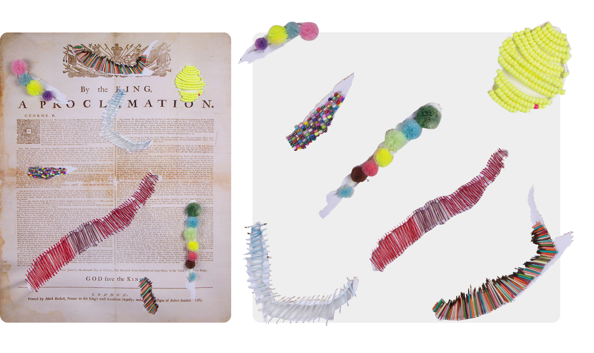
The Treaty Map site integrates Michelle Sound's art piece Proclamation by deconstructing it into its core visual elements. I incorporated the artwork's color palette and textures into the website's design. This method ensures the site doesn't just display the art, but respectfully embodies its spirit, making it a fundamental part of the user experience.
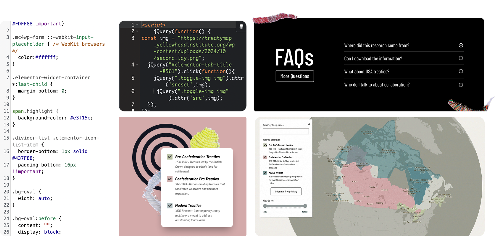
The Treaty Map website was created using WordPress and Elementor. However, to implement custom features not available in Elementor, we built our own custom elements with JavaScript and CSS, combining the efficiency of a page builder with the flexibility of custom code.
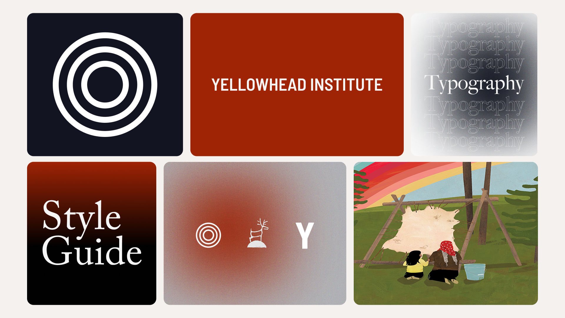
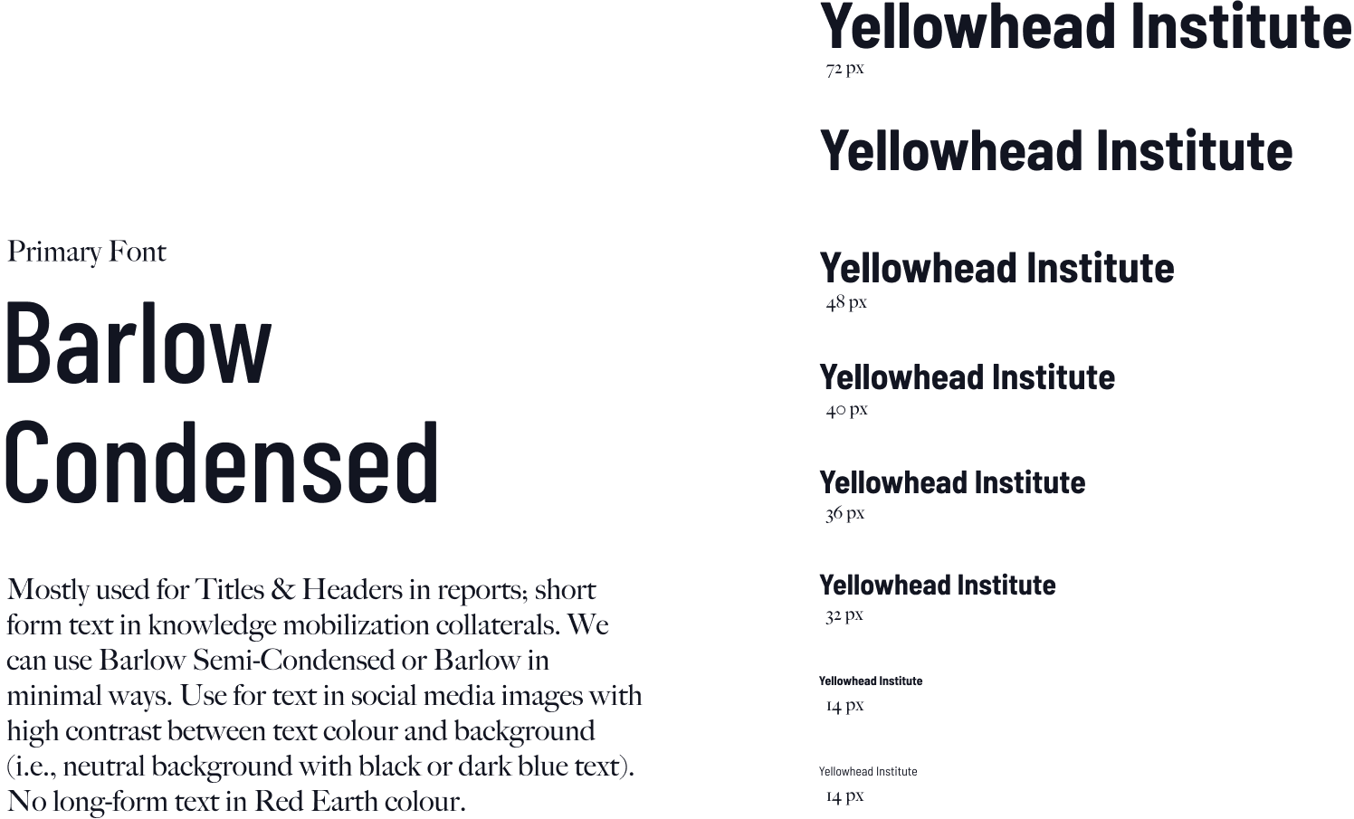
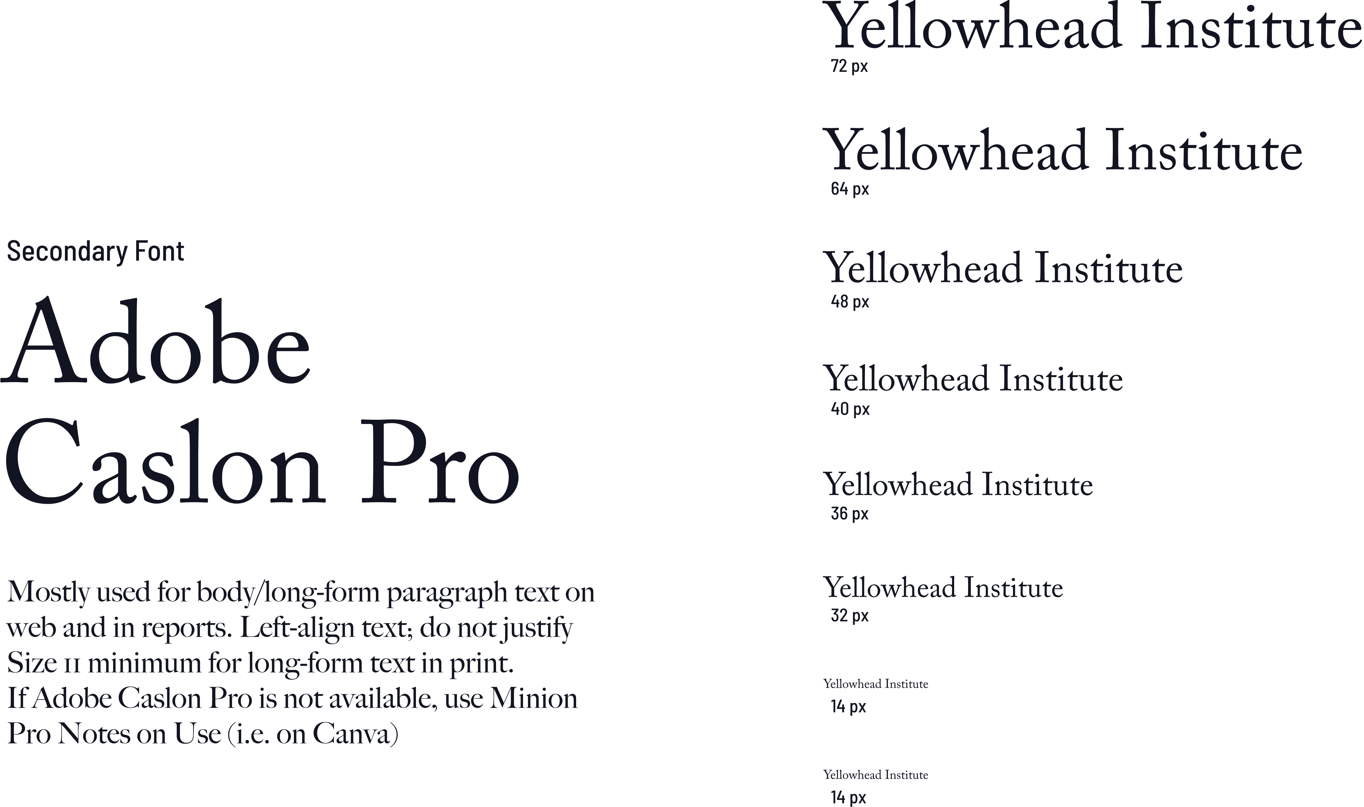
Yellowhead Institute's style guide utilizes a palette of #9F2305 for primary accents, lending a historical depth, paired with the grounding near-black of #121521 for text and structure. The soft off-white #F3F1ED provides a clean contrast, ensuring readability and visual balance across all communications.
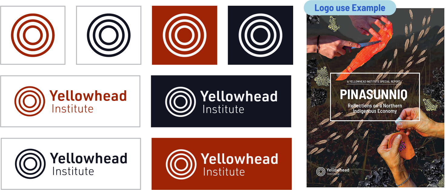
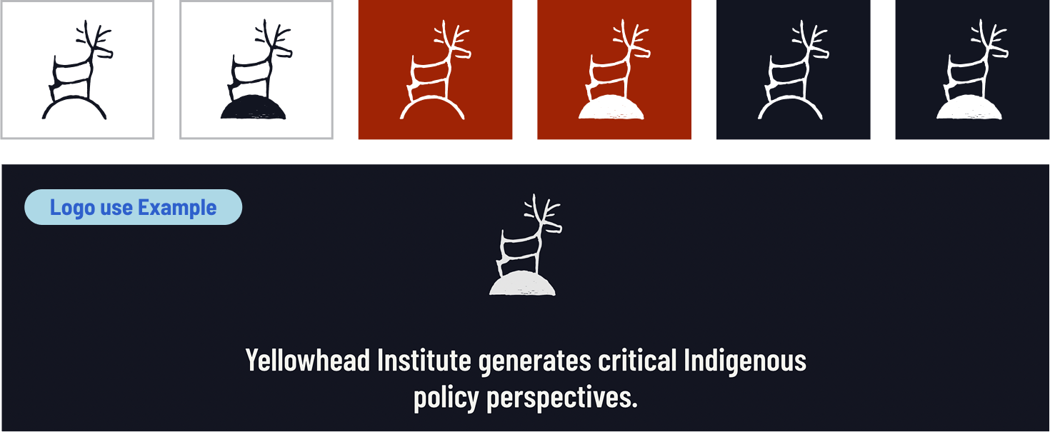
These are examples on how to use the logo. Using Primary colours with the logo and background. Black and white can be used for non-duotonesd photography or print use cases. Using logo for other colour schemes canbe used based on the theme of use (e.g. briefs, special reports, courses, etc).
These are examples on how to use the logo. Using Primary colours with the logo and background. Black and white can be used for non-duotonesd photography or print use cases. Using logo for other colour schemes canbe used based on the theme of use (e.g. briefs, special reports, courses, etc).
Logo should be used full size until it reaches a minimum sizes.

Yellowhead School is rooted in Indigenous pedagogy, knowledge, and commitmentto a decolonial future.
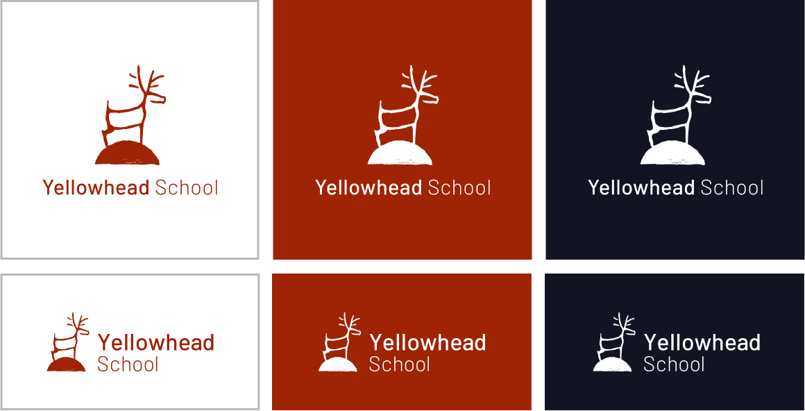
Yellowhead School is rooted in Indigenous pedagogy, knowledge, and commitmentto a decolonial future.